AVERY
  • Portfolio
  • Articles
  • Connect

HI SOCIAL MOBILE APP​

I started working with this early-stage startup, Hi Social, in May 2021. I collaborated with the CEO, University of Virginia professors, and a team of software developers to design the UI/UX from scratch, including the branding.

​I've continued part-time as the only UI/UX Designer and eventually started working with an additional designer to help with research and design feedback. Our initial launch is for colleges, so most use cases will be focused on college students.

It's hard to meet new people these days.

Especially after the pandemic, many people find it difficult to make new connections. Whether for making friends, networking with those in your field, or finding new potential partners, it's common for people to turn to apps. However, these apps (e.g. Instagram, LinkedIn, Tinder, etc.) are all lacking one key component: face-to-face, natural encounters.

Hi Social facilitates natural, in-real-life connection.

The serial entrepreneur CEO and UVA professors who founded Hi Social had a vision for an app that would encourage you to look away from your phone and connect with those around you.

​Hi Social aims to help others connect with new people they might not otherwise meet by helping to find local, compatible people, then making it easy to meet them in-person naturally.

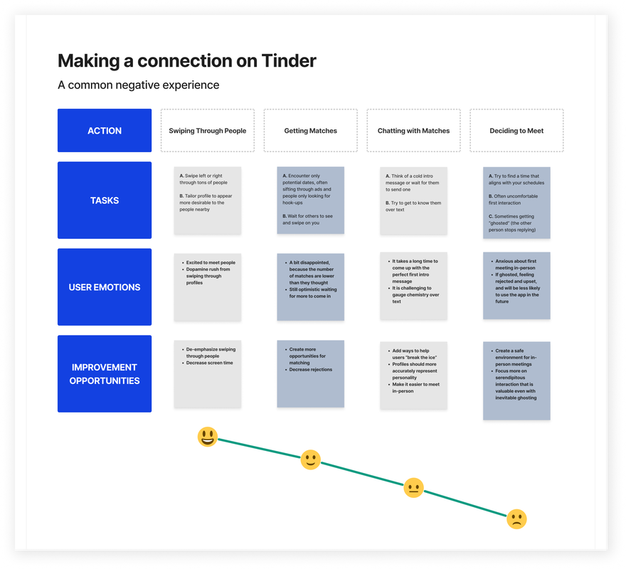
We asked people about their social lives.

We got a sense for how people meet people both in-person and on popular social networking apps today. We studied a wide variety of people, spanning from college students to older folks with grown children (all with a variety of living situations).

​In the following images, you can see some of the results.

Key findings:
  • People want to meet more people in-person, but they don't have the time or don't know how, it needs to be easy
  • Safety is a big reason why people do not use current social networking apps, and it's even more important for Hi Social
  • Many people struggle to meet people in-person, especially people that they click with
  • Swiping through profiles on other apps rarely leads to genuine connection, rather it leads to more screen time

On other apps, real connection is rare.

As discovered through our survey, the top two reasons why people do not like current social networking apps are (1) meeting compatible people is rare, and (2) connecting in-person is interrupted by ghosting.

To inform how Hi Social would be designed differently, we outlined a common negative experience that users have making an in-person connection with a popular app, Tinder.

Through the research and thinking through this journey map, we concluded that Hi Social needed to: (1) de-emphasize swiping and discourage long screen time, (2) prioritize safety, and (3) create an environment for people to easily meet in-person naturally.

​
Journey Map about making a connection on Tinder. This outlines a common negative experience of a Tinder user, going from swiping through people, getting matches, chatting with matches, and then deciding whether or not to meet in-person. It shows how difficult it is to make a real connection on apps like Tinder, and how it's even harder to make an in-person connection. It is rarely successful, and opens up opportunities for improvement with Hi Social.

A brand that represents connecting with the world.

Hi Social had an existing logo, and then the CEO wanted to incorporate Earth to represent connection across the globe. Therefore, I designed a modern Earth design element.
First, I opted for dark mode to differentiate from other bright social networking apps. It is also more incognito and understated.

I chose a calming blue and green as the core brand colors that pop against the dark backgrounds and feed the Earth & space motif.

For typography, I stuck with based Open Sans since it is round (think planets), readable, and accessible across devices.
Brand kit showing our brand colors, typography, dark mode + stars background, and the Earth design element.

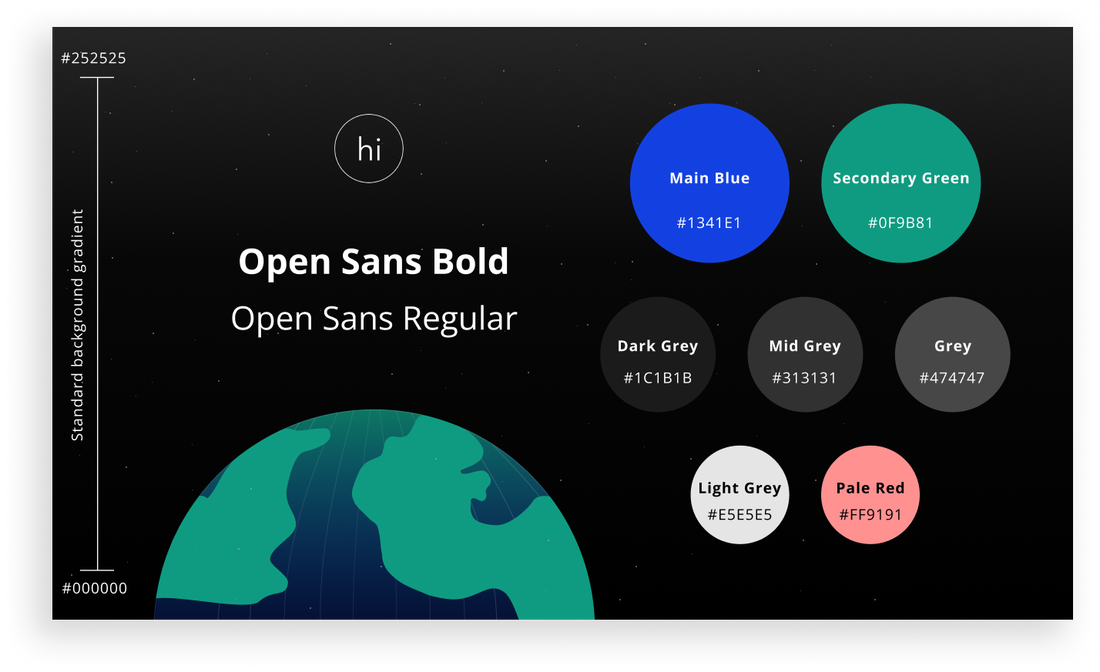
The design went through many evolutions.
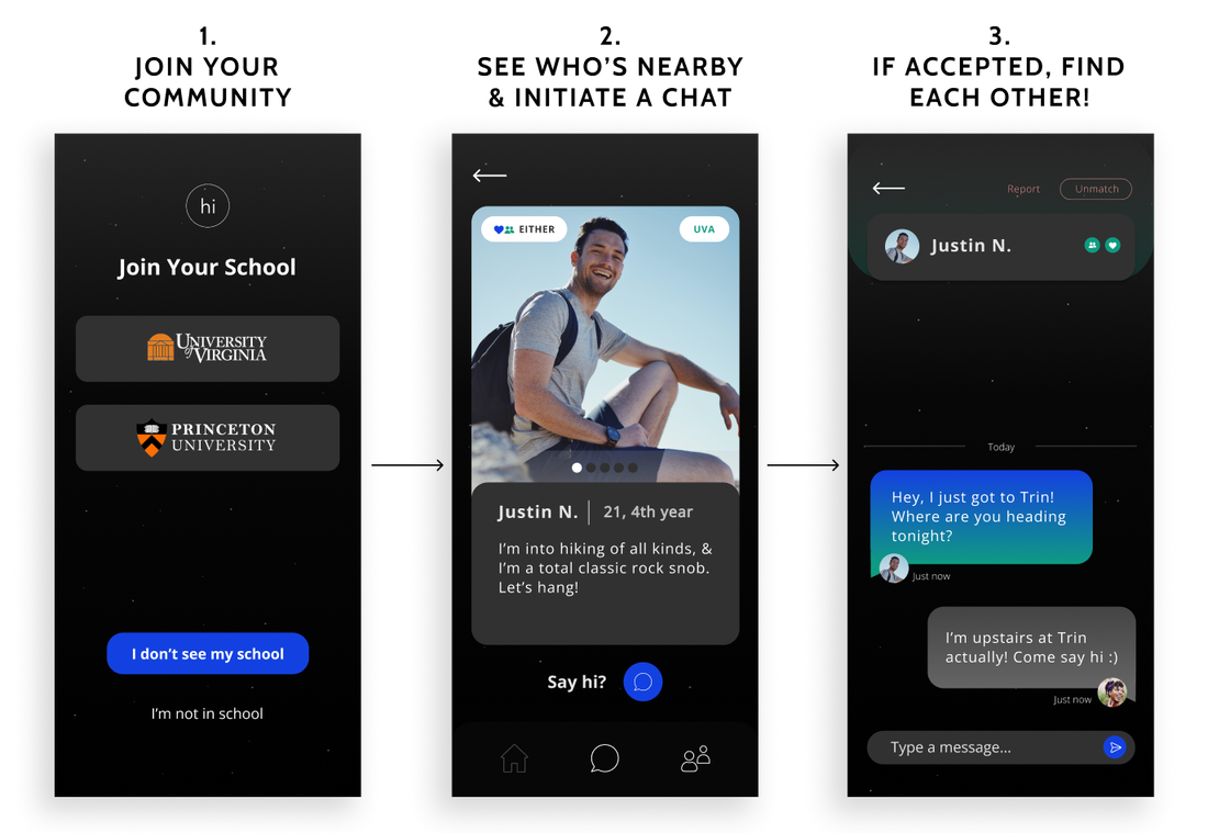
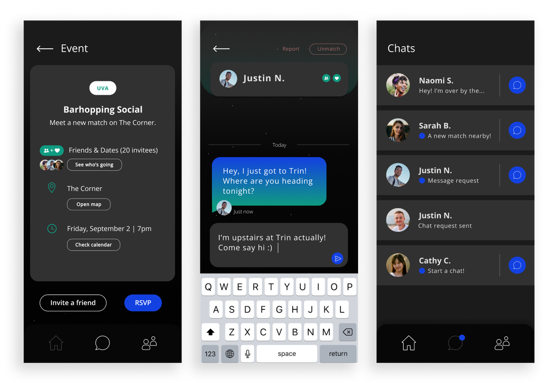
The current user experience and flow took iteration to reach. The founder, software engineers, and I toyed with a few other ideas before landing on this one.

Here you can see some early wireframes that helped form what Hi Social is today.
Early Hi Social wireframes. Showing screens about transparency, easy onboarding, our empty homescreen to emphasize looking away from screens, and potentially browsing profiles.

Here's how Hi Social works.

Simply join your community, and then you'll see compatible users at local events (both friends and dates, depending on preferences). Take a look at their profiles, then initiate a chat. If they accept, then you can chat and find each other IRL.
Showing the flow of Hi Social. 1- Join your community (select a university domain), 2- See who's nearby & initiate a chat, 3- If accepted, find each other! (an example chat of someone telling the other user where to find them in the bar)

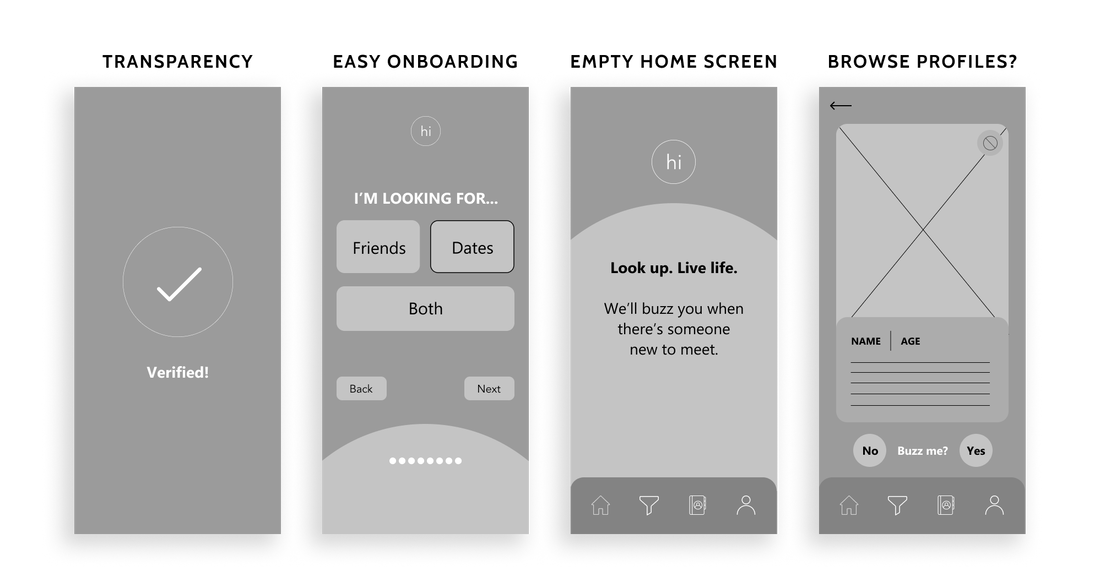
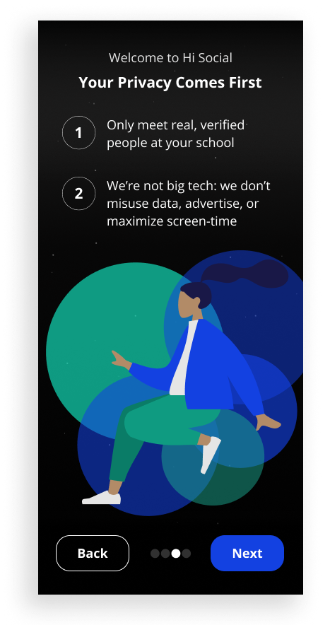
Privacy is imperative for an app like this.

Supported by the initial research, many users' primary concerns with this concept related to privacy. To help users to feel comfortable signing up for Hi Social, we included two different flexible privacy modes (the details of which are confidential at this time).

Also, in the early launch of Hi Social at colleges, a .EDU email is required to sign up. We make it clear during onboarding that privacy is a priority, so that users will feel comfortable completing sign-up.
An example screen that you can see during onboarding. It talks about how the user's privacy comes first, we only let in people with verified .EDU emails, and we prioritize data safety.

Meet people in-person naturally. No swiping needed.

Our research showed that people are tired of endless swiping and scrolling.

​Meeting people through apps also leads to ghosting, appearance-based judgment, and maximized screen time. People meet lots of people online, but rarely connect with people in-person.

That's why Hi Social has emphasized meeting in-person at events, rather than collecting connections on a screen.

Screens showing an example event you could be invited to, an example chat of someone finding their connection in real life, and a list of chats that a user might see.

What target users think.

Ahead of launch, I showed the designs to a few interested target users.
​Here are some of the things they had to say:

Hi Social revolutionizes how we socialize.

With this simple, IRL-first system, people can effortlessly meet other compatible friends, networking connections, and dates naturally in the real world, rather than through a screen.

Why stop there?

Next: Making Gmail more accessible for people with dyslexia.
READ NEXT PROJECT
  • Portfolio
  • Articles
  • Connect